Top Picks For You
START

11 Maps That Will Help You See the World in a Whole New Light

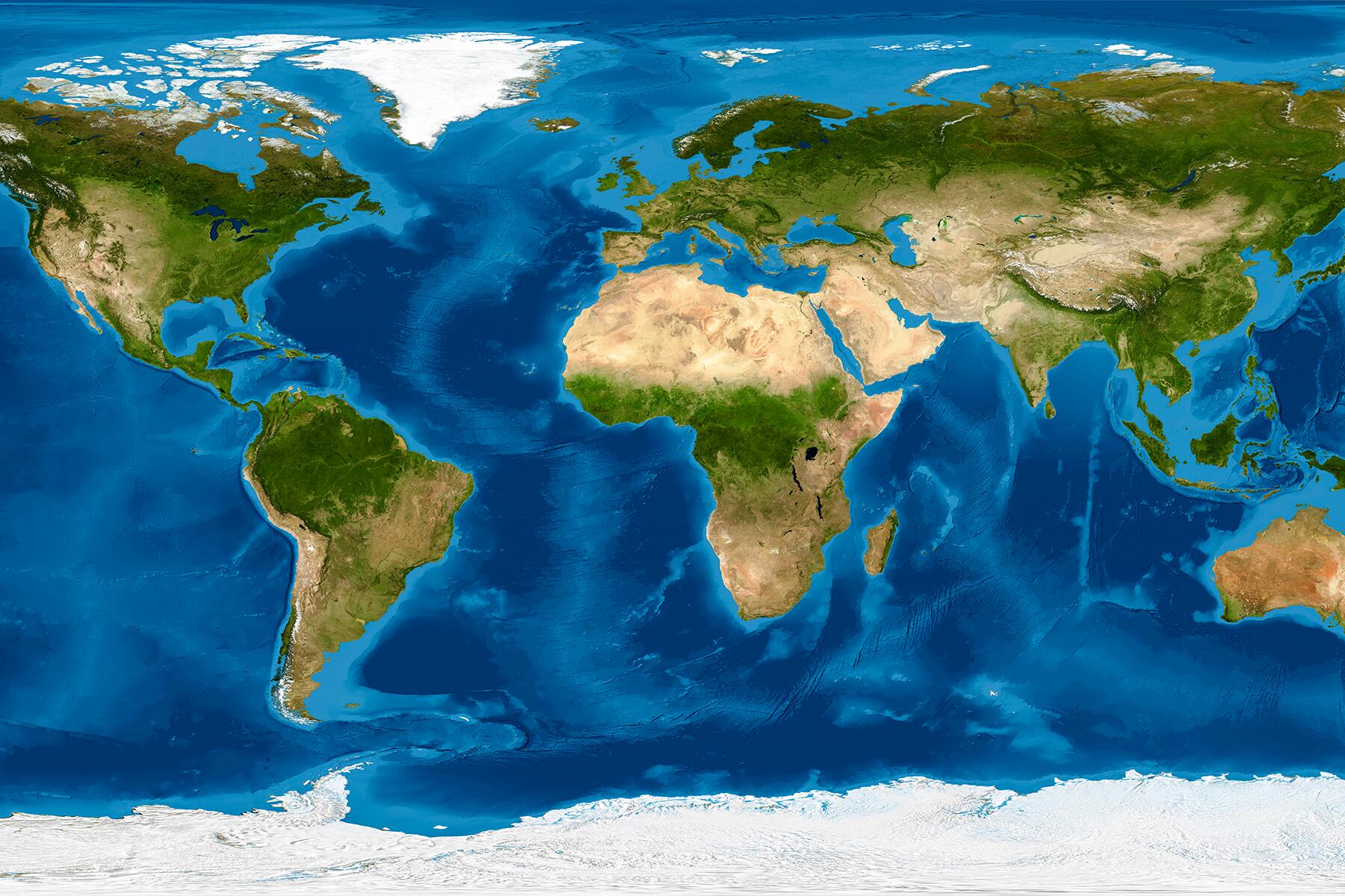
Cartography in modern times.

When I’m on a flight, I love watching the interactive flight path that shows what we’re flying over, the altitude and speed of the plane, and how much time I have before I can use the airport bathroom (I avoid airplane lavatories like the plague). It’s amusing to change the terrain on Google Maps when I’m in a mountain city and see my neighborhood on Google Earth.

Technology has added another dimension to maps: it has made them fun as well as informative. Did you know that there’s a map that introduces you to regional music? Or that there are many maps that show you what planes are flying overhead? And since we’re in the 21st century where conversations about climate change shouldn’t slip to the margins, online mapping tools are shedding light on mitigation and risks. Cartography has become so much more than scaling areas on paper (and countries fighting about it).

There are interesting, interactive maps on the internet that let you pick up the globe and view the world from different angles (figuratively). Here, you have a list of intelligent and awesome maps to increase your knowledge about the world we live in. I’ll bet you’ll find at least one you’ve never heard of before!

1 OF 11

Airheart

Where can you go from the U.S. if you’re vaccinated? What countries require you to wear masks in public spaces? Where in the world do you need to quarantine on arrival or take a COVID-19 test to enter? Airheart, in this extremely useful tool for the times we live in, shares all this data in a comprehensible, interactive way. You can choose filters and once the list of countries appears, you will find in-depth summaries for each country with restrictions, guidelines and mandates, and local guides and data on vaccine and COVID-19 cases.

If you’re planning a trip soon, this tool will definitely help you save time on basic research while picking a destination.

2 OF 11

IATA COVID-19 Travel Interactive Map

The International Air Transport Association launched this map to help travelers navigate this world of coronavirus-mandatory restrictions. A color-coded, interactive map, it categorizes countries as “Totally Restrictive,” “Partially Restrictive,” “Not Restrictive,” and “Latest Updates Currently Under Review.” When you click on a country, you get a dialogue box with information about its restrictions and further links to reduce your research time.

Another tool you can use to know about travel restrictions around the world is Sherpa.

3 OF 11

Native Land

A Canadian non-profit has designed the Native Land tool. This interactive map allows users to enter their address and see which indigenous tribe the land belonged to. The results lead you to different websites of tribes and you can also learn about their languages and treaties associated with their land.

It’s important to acknowledge the roots of colonialism and its impact on Indigeous communities. The website states, “We aim to improve the relationship of people, Indigenous and non-Indigenous, with the land around them and with the real history and sacredness of that land. This involves acknowledging and righting the wrongs of history, and also involves a personal journey through the importance of connecting with the earth, its creatures, and its teachings.”

4 OF 11

Climate Impact Map

Spend some time on the Climate Impact Map to understand how the world is changing due to emissions. You can look at historic data and projected climate change impacts: rise in temperatures, mortality costs, and energy costs. For example, you can see how many hot days your state will experience in the mid-century with high emissions, or how the economy will fare under moderate emissions. You can also select different probabilities since it’s a forecast. 

A simple indicator is the average temperature: compare what temperature was in your state when you were younger and how much it’s projected to change—the colors will drastically turn from blue to orange/yellow with a mouse click when you go from historical to end of century.

5 OF 11

Radiooooo

You will love this site (and app) that lets you pick a decade (from 1900 to now), a mood, and a region on an interactive map, and takes you on a tuneful discovery. This musical time machine introduces you to artists and songs from around the world; just imagine an orchestrated road trip and catching the local radio station. If you join it, you get to select multiple decades and regions and you can choose a theme or an artist, among other features. It’s a user-generated tool, so even you can add to it as a member. Hop from one country and decade to another, and shuffle it up—you’ll find some gems here.

6 OF 11

Migrations in Motion

This glittering Migrations in Motion map is a beautiful, animated representation of an unfortunate impact of climate change: the movement of animals to survive. The directions of around 3,000 species of birds, mammals, and amphibians are plotted on this map focusing on the Americas to predict where they will migrate to find hospitable climates. 

Since the wildlife is moving towards higher altitudes to adapt to the warming planet, scientists suggest that we need to rebuild and maintain connectivity to allow them passage. “Removing fencing, adding wildlife overpasses (or underpasses) to major roadways, and better routing of infrastructure like pipelines and powerlines can all help reconnect areas fragmented by human development,” the website notes.

7 OF 11

Flightradar24

This Swedish global flight tracker will eat up hours of your time—Flightradar24 is that addictive. You can check where each flight is, what altitude it’s flying at, the make of the plane, and scheduled arrival. Search particular flights or click on the tiny planes flying over the map. There is an app version also, and you can buy a subscription to go ad-free and unlock features such as historical data. It’s pretty cool that you can change the map style and see cloud cover, turbulence, navigational aids, air traffic controller boundaries, and wind speed (paid version). Locate an airport in your city and see the many planes landing and taking off on runways, or hovering in your airspace.

8 OF 11

The Refugee Project

There are 26.6 million refugees in the world according to the UNHCR. Millions of people get displaced every year, forced to flee their homes and risk their lives in hopes to find a better life. The Refugee Project is an interactive map that depicts where refugee populations are originating from and the asylum countries they’re living in. The bigger the circle, the more displaced population (Syria had a refugee population of 6,688,996 in 2020). You can also see the countries that have sheltered the displaced populations country-wise and check historical records since 1975.

9 OF 11

The Carbon Map

Another animated map that showcases the causes and risks of climate change, the Carbon Map relays how different countries are adding to emissions and the populations that are vulnerable to it. The map is divided into three sections: background, responsibility, and vulnerability, and as you click on sub-sections (let’s say historical responsibility), the countries go bigger or smaller and data points are revealed (the U.S. ranks the highest on historical responsibility). It’s a great way to understand the biggest polluters in the world and the impacts of climate change on countries.

10 OF 11

The True Size

Maps aren’t accurate because spheres are difficult to project out in 2D. They distort sizes, so Greeland appears to be as big as Africa on many maps, when it’s actually 14 times smaller. So, this digital map helps you see the real size of a city or a country. Search for New York and you’ll see its outline, which you can then move around and compare to other cities–superimpose it on Tajikistan and you’ll see NYC is a comparable size to the state.

11 OF 11

Population.io

Not technically a map but still immensely interesting, World Data Lab has designed Population.io to help you find your place in the world. When you enter your date of birthday, country of birth, and sex at birth, it calculates your projected life expectancy, milestones, how many people are older/younger than you, and other demographical statistics. The website calls it “the journey of your life in numbers and dates.”

1 Comments
K
KeithBr December 31, 2021

I can’t believe that you only included Northocentrtic maps. The ones from the southern perspective are equally enlightening